Animate.css
Содержание:
- Количество анимационных циклов
- Библиотека animate.css
- Анимация при скролле с помощью Animate.css и плагина wow.js
- Magic Animations
- Run Animation in Reverse Direction or Alternate Cycles
- CSS Reference
- CSS Properties
- CSS Properties
- Basic Usage
- CSS Animation Properties
- The @keyframes Rule
- The 6 steps of animation
- Правило @keyframes
- Specify the fill-mode For an Animation
- What are CSS animations?
- Frequently Asked Questions
- Animate.css
Количество анимационных циклов
По умолчанию любая анимация в CSS будет воспроизведена только один раз. Благодаря свойству animation-iteration-count мы сможем указывать сколько раз будет проигрываться анимационный цикл, это может быть, как произвольное число раз, либо указать, что анимация будет воспроизводиться бесконечно, в некоторых случаях это очень полезно.
Обратите внимание на то, что запрещается указывать отрицательные значения по объективным причинам, но допускается указывать не целые значения, при этом будет проигрываться только часть анимационного цикла — пропорционально указанному значению (например, значение 1.5 соответствует воспроизведению анимационного цикла полтора раза). Рассмотрим следующий пример:
Рассмотрим следующий пример:
<!DOCTYPE html>
<html>
<head>
	<meta charset = "UTF-8">
	<title>Повторение анимации</title>
<style>
div {
width: 50px; /* ширина элемента */
height: 50px; /* высота элемента */
border-radius: 100%; /* определяем форму углов элемента (скругляем) */
display: inline-block; /* устанавливаем элементы как блочно-строчные (выстраиваем в линейку) */
color: white; /* цвет шрифта */
padding: 15px; /* внутренние отступы элемента со всех сторон */
position: relative; /* относительное позиционирование (для возможности смещения во время анимации) */
text-align: center; /* выравниваем текст по центру */
line-height: 50px; /* устанавливаем высоту строки */
animation-duration: 1.5s; /* задаём продолжительность анимации 1,5 секунды */
animation-name: iliketomoveit; /* задаём имя анимации */
}
.test {
animation-iteration-count: 1; /* указываем, что анимация будет повторяться 1 раз */
}
.test2 {
animation-iteration-count: 2; /* указываем, что анимация будет повторяться 2 раза */
}
.test3 {
animation-iteration-count: 3.5; /* указываем, что анимация будет повторяться 3 с половиной раза */
}
.test4 {
animation-iteration-count: infinite; /* указываем, что анимация будет повторяться бесконечно */
}
@keyframes iliketomoveit {
	0%   {top: 0px;} /* начало цикла анимации */
	25%  {top: 200px; background: red;} /* 25% от продолжительности анимации */
	75%  {top: 100px;} /* 75% от продолжительности анимации */
	100% {top: 0px; background: black;} /* конец цикла анимации */
}
</style>
</head>
	<body>
		<a href = "javascript:window.location.reload()">Обновите перед просмотром</a></br>
		<div class = "test">1</div>
		<div class = "test2">2</div>
		<div class = "test3">3.5</div>
		<div class = "test4">infinite</div>
	</body>
</html>
В этом примере мы создали простую анимацию, в которой с помощью CSS свойства top смещаем элементы с относительным позиционированием относительно верхнего края текущей позиции, изменяя при этом цвет заднего фона элемента.
С использованием селектора класса и свойства animation-iteration-count мы указали различные значения, которые определяют количество проигрываний анимационного цикла у элементов.
Обратите внимание, что мы разместили ссылку, которая производит перезагрузку страницы с использованием URL псевдопротокола javascript:, который позволяет выполнить код языка программирования JavaScript таким образом. Не смотря на то, что это решает нашу задачу по перезагрузке страницы, никогда не используйте URL псевдопротокол javascript: на своих страницах
Так как эта тема выходит за рамки этой статьи и изучения CSS в целом, мы не будем в настоящее время на этом останавливаться.
Результат нашего примера:
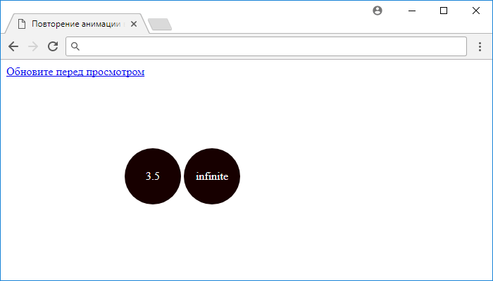
Рис. 193 Повторение анимации в CSS.
Библиотека animate.css
В большинстве случаев анимации применяется для создания известных типовых эффектов. Почему бы в таком случае не воспользоваться готовыми наработками в этой области? Есть несколько разных CSS-библиотек, которые достаточно лишь подключить к своему сайту и добавить к желаемым элементам заданный класс. Из таких библиотек популярными являются Animate.css и magic.
Animate.css это бесплатная библиотека доступная по адресу http://daneden.github.io/animate.css/. На сайте выбираете из списка готовый эффект и смотрите как он применяется к заголовку.

Для начала следует скачать библиотеку. Есть два варианта.
- Полная версия. Содержит более трёх тысяч строк кода объёмом около 60 кБ. Она хорошо подходит на первом этапе ознакомления с анимацией в целом, поскольку позволяет взглянуть, как всё устроено.
- Упакованная версия. В css-файле нет табуляции, пробелов и переносов строк. Объём файла за счёт этого сокращается раза в полтора, но читать код при этом становится затруднительно.
Далее подключаем файл animate.css через <link> как это делается с любым другим стилевым файлом.
Чтобы применить эффект анимации к желаемому элементу, добавляем к нему два класса — animated и класс с названием эффекта (список всех эффектов и их названия смотрим на сайте). Например, вы желаете добавить мерцание к изображению на странице. В HTML записываем следующее:
После загрузки страницы изображение померцает и анимация после этого остановится. Для бесконечного повторения добавьте класс infinite.
По умолчанию вся анимация в animate.css длится одну секунду, увеличить время можно через собственный стиль. Если требуется изменить продолжительность только у выбранного эффекта, то используйте класс animated.flash, как показано в примере 3. Вместо flash укажите применяемый эффект. Для изменения времени у всех эффектов оставьте только класс animated.
Пример 3. Использование animate.css
<!DOCTYPE html>
<html>
<head>
<meta charset=»utf-8″>
<title>Анимация</title>
<link href=»animate.css» rel=»stylesheet»>
<style>
.animated.flash {
animation-duration: 3s;
}
</style>
</head>
<body>
<p><img src=»image/figure.jpg» alt=»» class=»animated infinite flash»></p>
</body>
</html>
Анимация при скролле с помощью Animate.css и плагина wow.js
В том случае, если вам нужно, чтобы анимация запускалась только после того, как пользователь доберется до нужного места html-страницы с помощью скроллинга (полосы прокрутки), одной animate.css будет недостаточно. Проще всего воспользоваться для этого плагином WOW.js, который был написан еще в 2015 году, но работает до сих пор.
Подключение wow.js
Для того чтобы у вас срабатывала анимация при скролле, необходимо , но и файл плагина. Поскольку плагин написан на JavaSript, то после всей разметки перед закрывающим тегом нужно разместить тег с ссылкой на CDN:
Подключение wow.js
<script src=»https://cdnjs.cloudflare.com/ajax/libs/wow/1.1.2/wow.min.js»></script>
| 1 | <script src=»https://cdnjs.cloudflare.com/ajax/libs/wow/1.1.2/wow.min.js»></script> |
Можно также скачать плагин wow.js с репозитория на Github и подключить из локальной папки js:
Подключаем wow.js из локальной папки
JavaScript
<script src=»js/wow.min.js»></script>
| 1 | <script src=»js/wow.min.js»></script> |
После этого тега размещаем ниже еще один тег с вызовом основной функции плагина:
Вызов функции плагина WOW.js
JavaScript
<script>
new WOW().init();
</script>
|
1 |
<script> newWOW().init(); </script> |
Добавление в разметку класса wow
Это еще не все . Для того чтобы код плагина сработал, нужно к анимированным блоками добавить еще один класса — .
Добавить класс wow
<div class=»wow box animate__animated animate__pulse»><img src=»images/pic1.jpg» alt=»Dog»></div>
<div class=»wow box animate__animated animate__backInDown»><img src=»images/pic2.jpg» alt=»Girl»></div>
<div class=»wow box animate__animated animate__bounceIn»><img src=»images/pic3.jpg» alt=»Cat»></div>
|
1 |
<div class=»wow box animate__animated animate__pulse»><img src=»images/pic1.jpg»alt=»Dog»><div> <div class=»wow box animate__animated animate__backInDown»><img src=»images/pic2.jpg»alt=»Girl»><div> <div class=»wow box animate__animated animate__bounceIn»><img src=»images/pic3.jpg»alt=»Cat»><div> |
После этого плагин выполнит свою работу, т.е. будет отслеживать, где находится в данный момент полоса прокрутки, и запускать анимацию, когда появится нужный блок.
Смотрим на пример:
See the Pen animate.css wow.js by Elen (@ambassador) on CodePen.0
Настройки плагина wow.js
У плагина wow.js есть свои настройки, которые можно задать в коде при вызове основной функции:
Настройки wow.js
JavaScript
let wow = new WOW({
boxClass: ‘wow’, // класс блока по умолчанию
animateClass: ‘animated’, // класс анимации по умолчанию
offset: 0, // смещение от нижнего края браузера по умолчанию
mobile: true, // поддержка мобильных по умолчанию
live: true // постоянно проверяйте наличие новых WOW-элементов на странице по умолчанию
});
wow.init();
|
1 |
let wow=newWOW({ boxClass’wow’,// класс блока по умолчанию animateClass’animated’,// класс анимации по умолчанию offset,// смещение от нижнего края браузера по умолчанию mobiletrue,// поддержка мобильных по умолчанию livetrue// постоянно проверяйте наличие новых WOW-элементов на странице по умолчанию }); wow.init(); |
Также настройки можно задать с помощью data-атрибутов:
- – позволяет указать время проигрывания анимации. Значение указывается в секундах (s) или миллисекундах (ms). Заменяет классы с типа в animate.css;
- – задает задержку перед проигрыванием анимации в секундах (s) или миллисекундах (ms). Заменяет собой в animate.css, но при этом вы устанавливаете свое значение;
- – количество пикселей от низа экрана до края элемента, когда включается анимация для него;
- – количество повторов анимации. Заменяет в animate.css.
Пример:
Настройки wow.js с помощью data-атрибутов
<div class=»wow animate__animated animate__flipInY» data-wow-offset=»200″
data-wow-delay=»1.5s» data-wow-duration=»2s»>
<img src=»images/pic1.jpg» alt=»Cat»>
</div>
|
1 |
<div class=»wow animate__animated animate__flipInY»data-wow-offset=»200″ data-wow-delay=»1.5s»data-wow-duration=»2s»> <img src=»images/pic1.jpg»alt=»Cat»> <div> |
Все эти атрибуты не являются обязательными и указываются по мере необходимости. Если их нет, анимация будет проигрываться по умолчанию, как только элемент появится на экране при прокрутке окна браузера.
Просмотров:
694
Magic Animations
Magic Animations has been one of the most impressive animation libraries available. It has many different animations, many of which are quite unique to this library. As with Animate.css, you can implement Magic by simply importing the CSS file. You can also implement the animations using jQuery. This project offers a particularly cool demo application.
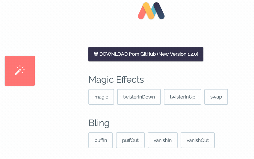
- Current Version: 1.4.1
- Popularity: 6,074 stars on GitHub
- Description: “CSS3 Animations with special effects”
- Library Size: 54.9 kB (minified)
- GitHub: https://github.com/miniMAC/magic
- License: MIT license.
Magic Animation’s file size is moderate compared to Animate.css and it is known for its signature animations, such as the magic effects, foolish effects, and bomb effects.
If you’re looking for something a little out of the ordinary, go for it. You won’t be disappointed.
Run Animation in Reverse Direction or Alternate Cycles
The property specifies
whether an animation should be played forwards, backwards or in alternate
cycles.
The animation-direction property can have the following values:
-
— The animation is played as normal
(forwards). This is default -
— The animation is played in
reverse direction (backwards) -
— The animation is played
forwards first, then backwards -
— The animation is played
backwards first, then forwards
The following example will run the animation in reverse direction (backwards):
Example
div {
width: 100px; height: 100px;
position: relative; background-color: red;
animation-name: example;
animation-duration: 4s; animation-direction:
reverse;}
The following example uses the value «alternate» to make the animation
run forwards first, then backwards:
Example
div {
width: 100px; height: 100px;
position: relative; background-color: red; animation-name: example; animation-duration: 4s; animation-iteration-count: 2; animation-direction:
alternate;}
The following example uses the value «alternate-reverse» to make the animation
run backwards first, then forwards:
Example
div { width: 100px; height: 100px;
position: relative; background-color: red; animation-name: example; animation-duration: 4s; animation-iteration-count: 2; animation-direction:
alternate-reverse;}
CSS Reference
CSS ReferenceCSS Browser SupportCSS SelectorsCSS FunctionsCSS Reference AuralCSS Web Safe FontsCSS Fallback FontsCSS AnimatableCSS UnitsCSS PX-EM ConverterCSS ColorsCSS Color ValuesCSS Default ValuesCSS Entities
CSS Properties
align-content
align-items
align-self
all
animation
animation-delay
animation-direction
animation-duration
animation-fill-mode
animation-iteration-count
animation-name
animation-play-state
animation-timing-function
backface-visibility
background
background-attachment
background-blend-mode
background-clip
background-color
background-image
background-origin
background-position
background-repeat
background-size
border
border-bottom
border-bottom-color
border-bottom-left-radius
border-bottom-right-radius
border-bottom-style
border-bottom-width
border-collapse
border-color
border-image
border-image-outset
border-image-repeat
border-image-slice
border-image-source
border-image-width
border-left
border-left-color
border-left-style
border-left-width
border-radius
border-right
border-right-color
border-right-style
border-right-width
border-spacing
border-style
border-top
border-top-color
border-top-left-radius
border-top-right-radius
border-top-style
border-top-width
border-width
bottom
box-decoration-break
box-shadow
box-sizing
break-after
break-before
break-inside
caption-side
caret-color
@charset
clear
clip
clip-path
color
column-count
column-fill
column-gap
column-rule
column-rule-color
column-rule-style
column-rule-width
column-span
column-width
columns
content
counter-increment
counter-reset
cursor
direction
display
empty-cells
filter
flex
flex-basis
flex-direction
flex-flow
flex-grow
flex-shrink
flex-wrap
float
font
@font-face
font-family
font-feature-settings
font-kerning
font-size
font-size-adjust
font-stretch
font-style
font-variant
font-variant-caps
font-weight
gap
grid
grid-area
grid-auto-columns
grid-auto-flow
grid-auto-rows
grid-column
grid-column-end
grid-column-gap
grid-column-start
grid-gap
grid-row
grid-row-end
grid-row-gap
grid-row-start
grid-template
grid-template-areas
grid-template-columns
grid-template-rows
hanging-punctuation
height
hyphens
image-rendering
@import
isolation
justify-content
@keyframes
left
letter-spacing
line-height
list-style
list-style-image
list-style-position
list-style-type
margin
margin-bottom
margin-left
margin-right
margin-top
mask-image
mask-mode
mask-origin
mask-position
mask-repeat
mask-size
max-height
max-width
@media
min-height
min-width
mix-blend-mode
object-fit
object-position
opacity
order
orphans
outline
outline-color
outline-offset
outline-style
outline-width
overflow
overflow-wrap
overflow-x
overflow-y
padding
padding-bottom
padding-left
padding-right
padding-top
page-break-after
page-break-before
page-break-inside
perspective
perspective-origin
pointer-events
position
quotes
resize
right
row-gap
scroll-behavior
tab-size
table-layout
text-align
text-align-last
text-decoration
text-decoration-color
text-decoration-line
text-decoration-style
text-indent
text-justify
text-overflow
text-shadow
text-transform
top
transform
transform-origin
transform-style
transition
transition-delay
transition-duration
transition-property
transition-timing-function
unicode-bidi
user-select
vertical-align
visibility
white-space
widows
width
word-break
word-spacing
word-wrap
writing-mode
z-index
CSS Properties
align-contentalign-itemsalign-selfallanimationanimation-delayanimation-directionanimation-durationanimation-fill-modeanimation-iteration-countanimation-nameanimation-play-stateanimation-timing-functionbackface-visibilitybackgroundbackground-attachmentbackground-blend-modebackground-clipbackground-colorbackground-imagebackground-originbackground-positionbackground-repeatbackground-sizeborderborder-bottomborder-bottom-colorborder-bottom-left-radiusborder-bottom-right-radiusborder-bottom-styleborder-bottom-widthborder-collapseborder-colorborder-imageborder-image-outsetborder-image-repeatborder-image-sliceborder-image-sourceborder-image-widthborder-leftborder-left-colorborder-left-styleborder-left-widthborder-radiusborder-rightborder-right-colorborder-right-styleborder-right-widthborder-spacingborder-styleborder-topborder-top-colorborder-top-left-radiusborder-top-right-radiusborder-top-styleborder-top-widthborder-widthbottombox-decoration-breakbox-shadowbox-sizingbreak-afterbreak-beforebreak-insidecaption-sidecaret-color@charsetclearclipclip-pathcolorcolumn-countcolumn-fillcolumn-gapcolumn-rulecolumn-rule-colorcolumn-rule-stylecolumn-rule-widthcolumn-spancolumn-widthcolumnscontentcounter-incrementcounter-resetcursordirectiondisplayempty-cellsfilterflexflex-basisflex-directionflex-flowflex-growflex-shrinkflex-wrapfloatfont@font-facefont-familyfont-feature-settingsfont-kerningfont-sizefont-size-adjustfont-stretchfont-stylefont-variantfont-variant-capsfont-weightgapgridgrid-areagrid-auto-columnsgrid-auto-flowgrid-auto-rowsgrid-columngrid-column-endgrid-column-gapgrid-column-startgrid-gapgrid-rowgrid-row-endgrid-row-gapgrid-row-startgrid-templategrid-template-areasgrid-template-columnsgrid-template-rowshanging-punctuationheighthyphensimage-rendering@importisolationjustify-content@keyframesleftletter-spacingline-heightlist-stylelist-style-imagelist-style-positionlist-style-typemarginmargin-bottommargin-leftmargin-rightmargin-topmask-imagemask-modemask-originmask-positionmask-repeatmask-sizemax-heightmax-width@mediamin-heightmin-widthmix-blend-modeobject-fitobject-positionopacityorderorphansoutlineoutline-coloroutline-offsetoutline-styleoutline-widthoverflowoverflow-wrapoverflow-xoverflow-ypaddingpadding-bottompadding-leftpadding-rightpadding-toppage-break-afterpage-break-beforepage-break-insideperspectiveperspective-originpointer-eventspositionquotesresizerightrow-gapscroll-behaviortab-sizetable-layouttext-aligntext-align-lasttext-decorationtext-decoration-colortext-decoration-linetext-decoration-styletext-indenttext-justifytext-overflowtext-shadowtext-transformtoptransformtransform-origintransform-styletransitiontransition-delaytransition-durationtransition-propertytransition-timing-functionunicode-bidiuser-selectvertical-alignvisibilitywhite-spacewidowswidthword-breakword-spacingword-wrapwriting-modez-index
Basic Usage
- Include the stylesheet on your document’s
<head><linkrel="stylesheet"href="animate.min.css"></head>
<head><linkrel="stylesheet"href="https://cdn.jsdelivr.net/npm/animate.css@3.5.2/animate.min.css"><linkrel="stylesheet"href="https://cdnjs.cloudflare.com/ajax/libs/animate.css/3.5.2/animate.min.css"></head>
<head><linkrel="stylesheet"href="https://cdn.jsdelivr.net/npm/animate.css@3.5.2/animate.min.css"integrity="sha384-OHBBOqpYHNsIqQy8hL1U+8OXf9hH6QRxi0+EODezv82DfnZoV7qoHAZDwMwEJvSw"crossorigin="anonymous"><linkrel="stylesheet"href="https://cdnjs.cloudflare.com/ajax/libs/animate.css/3.5.2/animate.min.css"integrity="sha384-OHBBOqpYHNsIqQy8hL1U+8OXf9hH6QRxi0+EODezv82DfnZoV7qoHAZDwMwEJvSw"crossorigin="anonymous"></head>
-
Add the class to the element you want to animate. You may also want to include the class for an infinite loop.
-
Finally you need to add one of the following classes:
| Class Name | |||
|---|---|---|---|
Full example:
<h1class="animated infinite bounce delay-2s">Example</h1>
CSS Animation Properties
The following table lists the @keyframes rule and all the CSS animation properties:
| Property | Description |
|---|---|
| @keyframes | Specifies the animation code |
| animation | A shorthand property for setting all the animation properties |
| animation-delay | Specifies a delay for the start of an animation |
| animation-direction | Specifies whether an animation should be played forwards, backwards or in alternate cycles |
| animation-duration | Specifies how long time an animation should take to complete one cycle |
| animation-fill-mode | Specifies a style for the element when the animation is not playing (before it starts, after it ends, or both) |
| animation-iteration-count | Specifies the number of times an animation should be played |
| animation-name | Specifies the name of the @keyframes animation |
| animation-play-state | Specifies whether the animation is running or paused |
| animation-timing-function | Specifies the speed curve of the animation |
❮ Previous
Next ❯
The @keyframes Rule
When you specify CSS styles inside the
rule, the animation will gradually change from the current style to the new style
at certain times.
To get an animation to work, you must bind the animation to an element.
The following example binds the «example» animation to the <div> element.
The animation will last for 4 seconds, and it will gradually change the
background-color of the <div> element from «red» to «yellow»:
Example
/* The animation code */
@keyframes example {
from {background-color: red;}
to {background-color: yellow;}
}/* The element to apply the animation to */
div { width: 100px; height: 100px;
background-color: red;
animation-name: example; animation-duration: 4s;
}
Note: The property
defines how long an animation should take to complete. If the property is not specified,
no animation will occur, because
the default value is 0s (0 seconds).
In the example above we have specified when the style will change by using
the keywords «from» and «to» (which represents 0% (start) and 100% (complete)).
It is also possible to use percent. By using percent, you can add as many
style changes as you like.
The following example will change the background-color of the <div>
element when the animation is 25% complete, 50% complete, and again when the animation is 100% complete:
Example
/* The animation code */@keyframes example
{
0% {background-color: red;}
25% {background-color: yellow;}
50% {background-color: blue;}
100% {background-color: green;}
}/* The element to apply the animation to */div {
width: 100px; height: 100px; background-color: red; animation-name: example; animation-duration: 4s;}
The following example will change both the background-color and the position of the <div>
element when the animation is 25% complete, 50% complete, and again when the animation is 100% complete:
Example
/* The animation code */@keyframes example
{
0% {background-color:red; left:0px; top:0px;}
25% {background-color:yellow; left:200px; top:0px;}
50% {background-color:blue; left:200px; top:200px;}
75% {background-color:green; left:0px; top:200px;}
100% {background-color:red; left:0px; top:0px;}
}/* The element to apply the animation to */div {
width: 100px; height: 100px;
position: relative; background-color: red; animation-name: example; animation-duration: 4s;}
The 6 steps of animation
We’ve talked about the workflow of the animation filmmaking pipeline, now lets go into the actual steps of character animation.
Here are the 6 steps of animation:
- Shooting reference video
- Key posing
- Blocking
- Splining
- Smoothing
- Adding life
Step 1: Shooting Reference video
This is a very important and overlooked step. It’s weird how people really think they know what certain actions look like, and how long they take, but end up getting it wrong.
Physical actions are something you need to analyze before animating, especially if you’re a beginner.
You have a shot of a guy throwing a baseball? Search YouTube for videos of pitchers throwing balls.
Don’t assume you know what an action looks like just because you’ve seen it before.
Looking at an action as an animator is completely different from looking at it as a viewer.
Step 2: Posing
After shooting a reference, it’s time to create the key poses of the shot.
These poses are called key poses because they are the most important poses of the shot. These are the poses that convey the story of the shot. We need to make sure we get those poses right, because we’re going to build on those for the rest of the process.
Step 3: Blocking
Once we’re happy with our key poses, we start breaking down the movement from each pose to the next by adding ‘in betweens’ (also known as breakdown poses or passing poses). These are the poses that connect the key poses.
We keep adding more poses until the movement looks as good as it could, while still staying in stepped mode (stepped mode is when you don’t allow interpolation between poses, which results in a very choppy/blocky motion).
Step 4: Splining
Splining is a 3D animation term. It’s the process in which you convert the interpolation of the keys from stepped to spline.
In other words – you make the computer connect the movement between each of your poses, and that makes the movement look smoother.
The problem is that the computer doesn’t do a very good job at interpolating. It only works with what it has. That’s why the better the blocking is – the better the splined version is going to look.
Step 5: Refining & offset
Now that all of our keys are in spline mode, we need to work on them. We refined the animation curves and make sure the movement looks smooth.
It’s also a good idea to offset some of the actions so it doesn’t look so ‘stop and start’, as if the character is doing all the motion at once.
By the end of this step your shot should look pretty solid and almost finished.
Step 6: Adding life
This step is the a lot of fun.
We’re already finished with the grunt work of animation, and it’s time to add small imperfections that bring life to the character.
Правило @keyframes
Правило @keyframes позволяет создавать анимацию с помощью ключевых кадров — состояний объекта в определенный момент времени.
Ключевые кадры анимации создаются с помощью ключевых слов from и to (эквивалентны значениям 0% и 100%) или с помощью процентных пунктов, которых можно задавать сколько угодно. Также можно комбинировать ключевые слова и процентные пункты.
Если не задан начальный (from, 0%) или конечный (to, 100%) кадр, браузер установит для них расчётные значения анимируемых свойств такими, какими они были бы если бы не была применена анимация.
Если у двух ключевых кадров будут одинаковые селекторы, то последующий отменит действие предыдущего.
При определении анимации сразу после свойства @keyframes должно следовать имя данной анимации (данное имя затем должно быть указано в свойстве animation элемента, который будет анимирован).
Пример:
@keyframes move {
  from {
    transform: translateX(0px);
  }
  50% {
    transform: translateX(130px);
  }
  100% {
    transform: translateX(0px);
  }
}
Мы создали анимацию, которая работает следующим образом:
- Начало анимации (from можно было написать 0%) — положение элемента по оси Х равно 0px;
- Середина анимации (50%) — положение элемента по оси Х равно 130px;
- Конец анимации (to мы использовали 100%) — возвращаем элемент на начало анимации, т.е. положение элемента по оси Х равно 0px;
See the Pen <a href=’http://codepen.io/AmateR/pen/ONgOQY/’>ONgOQY</a> by Aleksei (<a href=’http://codepen.io/AmateR’>@AmateR</a>) on <a href=’http://codepen.io’>CodePen</a>.
Ключевые кадры можно группировать:
@keyframes move {
  from {
    transform: translateX(0px);
  }
  25%, 50% {
    transform: translateX(130px);
  }
  100% {
    transform: translateX(0px);
  }
}
Одному элементу можно назначить несколько анимаций, их имена и параметры надо писать в порядке присвоения:
element {
    animation-name: animation-1, animation-2;
    animation-duration: 2s, 4s;
}
Подключение анимации к элементу происходит двумя командами — animation-name и animation-duration.
Specify the fill-mode For an Animation
CSS animations do not affect an element before the first keyframe is played
or after the last keyframe is played. The animation-fill-mode property can
override this behavior.
The property specifies a
style for the target element when the animation is not playing (before it
starts, after it ends, or both).
The animation-fill-mode property can have the following values:
-
— Default value. Animation will not
apply any styles to the element before or after it is executing -
— The element will retain the
style values that is set by the last keyframe (depends on animation-direction
and animation-iteration-count) -
— The element will get the style
values that is set by the first keyframe (depends on animation-direction), and
retain this during the animation-delay period -
— The animation will follow the rules
for both forwards and backwards, extending the animation properties in both
directions
The following example lets the <div> element retain the style values from the
last keyframe when the animation ends:
Example
div { width: 100px; height: 100px; background: red; position: relative; animation-name: example; animation-duration: 3s;
animation-fill-mode: forwards;
}
The following example lets the <div> element get the style values set by the
first keyframe before the animation starts (during the animation-delay period):
Example
div { width: 100px; height: 100px;
background: red; position: relative;
animation-name: example;
animation-duration: 3s;
animation-delay: 2s; animation-fill-mode: backwards;
}
The following example lets the <div> element get the style values set
by the first keyframe before the animation starts, and retain the style values
from the last keyframe when the animation ends:
Example
div { width: 100px; height: 100px; background: red;
position: relative;
animation-name: example;
animation-duration: 3s;
animation-delay: 2s; animation-fill-mode: both;
}
What are CSS animations?
As you may or may not know, CSS stands for Cascading Style Sheets. CSS is used by Web browsers to determine how the HTML elements on your page are displayed.
CSS animations enable your content to visually transition from one style configuration to another. For beginners that lack experience writing code, this can be pretty intimidating.
Here’s a simplified example where text moves across the page using HTML and CSS:
Hello!
| h3 { | |
| animation-duration: 8s; | |
| animation-name: slidein; | |
| animation-iteration-count: infinite; | |
| } | |
| @keyframes slidein { | |
| 0% { | |
| margin-left: 0%; | |
| } | |
| 50% { | |
| margin-left: 300px; | |
| } | |
| 100% { | |
| margin-left: 0%; | |
| } | |
| } |
view raw
hosted with by GitHub
When you read the CSS, you can see:
- Total duration of the animation is 8 seconds (line 2).
- Animation being used is “slidein” (line 3).
- Animation is on an infinite loop (line 4).
- “Slidein” begins on the left hand side of the page (line 9).
- At half the duration, the title is 300px off the left side of the page (line 12).
- At the end of the animation, the text is back on the left hand side of the page (line 15).
If you’d like to try writing some CSS, you can modify the example above using CodePen.
As you explore CSS animations, you will discover dozens of properties that will enable you to customize your transitions so they work seamlessly within your design.
On the other hand, if you want to save time by using pre-built animations, you will want to use Animate.css.
Frequently Asked Questions
-
How much time do I need to render my animation?
The rendering depends on your machine’s hardware and your internet upload bandwidth, but also on
the complexity and resolution of the animation.A 3-6 seconds short animation, with a few filters used, should not take more than 30
seconds to save and render.
More complex animations can take a few minutes to be rendered. -
If you reach the limit and need to make more animations, you can upgrade to the Diamond subscription and have
all the limits removed. This way you can freely enjoy all the benefits. -
What is the best format to download my animations?
For the best quality, we recommend downloading your animation as an MP4 video.
It has the best quality for small size files.To help you work faster, you can create an animation, and set the loop value on download (this
will increase its length), without needing to adjust the timeline to achieve this.However, sometimes, you might need a GIF file format. This has lower quality and it is larger in
size than MP4. Since some applications support this format, it’s easier to embed a gif into your
website or blog. Plus, it’s a fun way to have a looped animation to share on social media. So
get creative!
Animate.css
Animate.css is one of the smallest and most easy-to-use CSS animation libraries available. Applying the Animate library to your project is as simple as linking the CSS and adding the required CSS classes to your HTML elements. You can also use jQuery to trigger the animations on a particular event if you prefer.
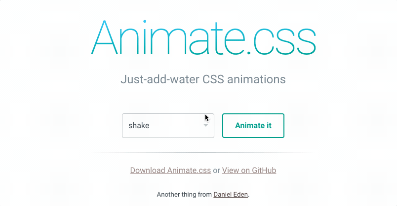
- Creators: Daniel Eden
- Released: 2013
- Current Version: 3.7.2
- Popularity: 62,284 stars on GitHub
- Description: “A cross-browser library of CSS animations. As easy to use as an easy thing.”
- Library Size: 56.7 kB (minified)
- GitHub: https://github.com/daneden/animate.css
- License:
At the time of writing, it’s still one of the most popular and widely-used CSS animation libraries and its minified file is small enough for inclusion in mobile websites as well.
Animate.css is still under active development. Watch out for version 4, which will support CSS custom properties (aka CSS variables). This is one of the simplest and most robust animation libraries and we wouldn’t hesitate to use this in any project.