Свойство border в css
Содержание:
Свойство border-style
Свойство border-style определяет тип отображения границы.
Это свойство принимает следующие значения:
- dotted – граница в точечку;
- dashed – штриховая граница;
- solid – сплошная граница;
- double – двойная граница;
- groove – трехмерная CSS рамка вокруг текста. Эффект зависит от значения border-color;
- ridge – трехмерная выпуклая рамка. Эффект зависит от значения border-color;
- inset – трехмерная утопленная рамка. Эффект зависит от значения border-color;
- outset – трехмерная внешняя граница. Эффект зависит от значения border-color;
- none – отключение границы;
- hidden – скрытая граница.
Свойство border-style может принимать от одного до четырех значений (для верхней, правой, нижней и левой границ).
Пример
Примечание: ни одно из представленных далее CSS-свойств для оформления границ не будет работать до тех пор, пока border-style не установлено.
Свойство border-width
Свойство border-width определяет ширину четырех границ. Можно указывать ее конкретный размер (в px, pt, cm, em, и т. д.) либо использовать одно из трех предустановленных значений: thin, medium или thick.
Свойство border-width может иметь от одного до четырех значений (для верхней, правой, нижней и левой рамки CSS).
Пример
Свойство border-color
Свойство border-color используется для указания цвета четырех границ.
Цвет можно установить с помощью:
- Названия: red, blue;
- Hex-значения: #ff0000;
- RGB-значения: rgb(255,0,0);
- Сделать прозрачным: значение transparent.
Свойство border-color может иметь от одного до четырех значений (для верхней, правой, нижней и левой границ).
Если значение border-color не установлено, то наследуется цвет элемента.
Пример
Border: отдельная стилизация границ
Из приведенных выше примеров видно, что можно устанавливать разную стилизацию для каждой стороны блока. В CSS-коде также имеются свойства для стилизации отдельных границ (top, right, bottom и left):
Пример
Приведенный выше пример даст тот же результат, что и:
Пример
Если у свойства border-style четыре значения:
• border-style: dotted solid double dashed; o верхняя граница будет точечной. o правая граница будет сплошной. o нижняя CSS двойная рамка. o левая граница будет в штрих.
Если у свойства border-style три значения:
• border-style: dotted solid double; o верхняя граница будет точечной. o правая и левая границы будут сплошными. o нижняя граница будет двойной.
Если у свойства border-style два значения:
• border-style: dotted solid; o верхняя и нижняя CSS рамки вокруг изображения будут точечными. o правая и левая границы будут сплошными.
Если у свойства border-style одно значение:
• border-style: dotted; o все четыре границы будут точечными.
В приведенном выше примере использовалось свойство border-style. Однако тот же принцип работы и у border-width, и у border-color.
Короткое свойство border
Чтобы сократить объем кода, значение для каждой отдельной границы можно указывать одним свойством:
- border-width;
- border-style (обязательное свойство);
- border-color.
Пример
Также можно выставлять свойства какой-то конкретной границы с одной из сторон:
Левая граница
Пример
Нижняя граница
Пример
Закругленные границы
Свойство border-radius используется для создания закругленных углов у CSS рамки вокруг текста или другого элемента.

Пример
Примечание: свойство border-radius не поддерживается в IE 8 и более ранних версиях.
Все свойства границ в CSS
| Свойство | Описание |
| Border | Позволяет выставить все свойства границ одним объявлением. |
| border-bottom | Позволяет выставить все свойства нижней границы одним объявлением. |
| border-bottom-color | Установка цвета нижней границы. |
| border-bottom-style | Установка стилизации нижней границы. |
| border-bottom-width | Установка толщины нижней границы. |
| border-color | Установка цвета четырех границ |
| border-left | Позволяет выставить все свойства левой границы одним объявлением. |
| border-left-color | Установка цвета левой рамки вокруг картинки CSS. |
| border-left-style | Установка стиля левой границы. |
| border-left-width | Установка толщины левой границы. |
| border-right | Позволяет выставить все свойства правой границы одним объявлением. |
| border-right-color | Установка цвета правой границы. |
| border-right-style | Установка стиля правой границы. |
| border-right-width | Установка толщины правой границы. |
| border-style | Установка стиля четырех границ. |
| border-top | Позволяет выставить все свойства верхней границы одним объявлением. |
| border-top-color | Установка цвета верхней границы. |
| border-top-style | Установка стиля верхней границы. |
| border-top-width | Установка толщины верхней границы. |
| border-width | Установка толщины четырех рамок CSS. |
Сергей Бензенкоавтор-переводчик статьи «CSS Border Properties»
CSS Tutorial
CSS HOMECSS IntroductionCSS SyntaxCSS SelectorsCSS How ToCSS CommentsCSS Colors
Colors
RGB
HEX
HSL
CSS Backgrounds
Background Color
Background Image
Background Repeat
Background Attachment
Background Shorthand
CSS Borders
Borders
Border Width
Border Color
Border Sides
Border Shorthand
Rounded Borders
CSS Margins
Margins
Margin Collapse
CSS PaddingCSS Height/WidthCSS Box ModelCSS Outline
Outline
Outline Width
Outline Color
Outline Shorthand
Outline Offset
CSS Text
Text Color
Text Alignment
Text Decoration
Text Transformation
Text Spacing
Text Shadow
CSS Fonts
Font Family
Font Web Safe
Font Fallbacks
Font Style
Font Size
Font Google
Font Pairings
Font Shorthand
CSS IconsCSS LinksCSS ListsCSS Tables
Table Borders
Table Size
Table Alignment
Table Style
Table Responsive
CSS DisplayCSS Max-widthCSS PositionCSS Z-indexCSS OverflowCSS Float
Float
Clear
Float Examples
CSS Inline-blockCSS AlignCSS CombinatorsCSS Pseudo-classCSS Pseudo-elementCSS OpacityCSS Navigation Bar
Navbar
Vertical Navbar
Horizontal Navbar
CSS DropdownsCSS Image GalleryCSS Image SpritesCSS Attr SelectorsCSS FormsCSS CountersCSS Website LayoutCSS UnitsCSS SpecificityCSS !importantCSS Math Functions
Relative Lengths
Relative length units specify a length relative to another length property.
Relative length units scale better between different rendering medium.
| Unit | Description | |
|---|---|---|
| em | Relative to the font-size of the element (2em means 2 times the size of the current font) | Try it |
| ex | Relative to the x-height of the current font (rarely used) | Try it |
| ch | Relative to the width of the «0» (zero) | Try it |
| rem | Relative to font-size of the root element | Try it |
| vw | Relative to 1% of the width of the viewport* | Try it |
| vh | Relative to 1% of the height of the viewport* | Try it |
| vmin | Relative to 1% of viewport’s* smaller dimension | Try it |
| vmax | Relative to 1% of viewport’s* larger dimension | Try it |
| % | Relative to the parent element | Try it |
Tip: The em and rem units are practical in creating perfectly
scalable layout!* Viewport = the browser window size. If the viewport is 50cm
wide, 1vw = 0.5cm.
JavaScript
JS Array
concat()
constructor
copyWithin()
entries()
every()
fill()
filter()
find()
findIndex()
forEach()
from()
includes()
indexOf()
isArray()
join()
keys()
length
lastIndexOf()
map()
pop()
prototype
push()
reduce()
reduceRight()
reverse()
shift()
slice()
some()
sort()
splice()
toString()
unshift()
valueOf()
JS Boolean
constructor
prototype
toString()
valueOf()
JS Classes
constructor()
extends
static
super
JS Date
constructor
getDate()
getDay()
getFullYear()
getHours()
getMilliseconds()
getMinutes()
getMonth()
getSeconds()
getTime()
getTimezoneOffset()
getUTCDate()
getUTCDay()
getUTCFullYear()
getUTCHours()
getUTCMilliseconds()
getUTCMinutes()
getUTCMonth()
getUTCSeconds()
now()
parse()
prototype
setDate()
setFullYear()
setHours()
setMilliseconds()
setMinutes()
setMonth()
setSeconds()
setTime()
setUTCDate()
setUTCFullYear()
setUTCHours()
setUTCMilliseconds()
setUTCMinutes()
setUTCMonth()
setUTCSeconds()
toDateString()
toISOString()
toJSON()
toLocaleDateString()
toLocaleTimeString()
toLocaleString()
toString()
toTimeString()
toUTCString()
UTC()
valueOf()
JS Error
name
message
JS Global
decodeURI()
decodeURIComponent()
encodeURI()
encodeURIComponent()
escape()
eval()
Infinity
isFinite()
isNaN()
NaN
Number()
parseFloat()
parseInt()
String()
undefined
unescape()
JS JSON
parse()
stringify()
JS Math
abs()
acos()
acosh()
asin()
asinh()
atan()
atan2()
atanh()
cbrt()
ceil()
clz32()
cos()
cosh()
E
exp()
expm1()
floor()
fround()
LN2
LN10
log()
log10()
log1p()
log2()
LOG2E
LOG10E
max()
min()
PI
pow()
random()
round()
sign()
sin()
sinh()
sqrt()
SQRT1_2
SQRT2
tan()
tanh()
trunc()
JS Number
constructor
isFinite()
isInteger()
isNaN()
isSafeInteger()
MAX_VALUE
MIN_VALUE
NEGATIVE_INFINITY
NaN
POSITIVE_INFINITY
prototype
toExponential()
toFixed()
toLocaleString()
toPrecision()
toString()
valueOf()
JS OperatorsJS RegExp
Modifiers:
g
i
m
Groups:
(x|y)
Metacharacters:
.
\w
\W
\d
\D
\s
\S
\b
\B
\0
\n
\f
\r
\t
\v
\xxx
\xdd
\uxxxx
Quantifiers:
+
*
?
{X}
{X,Y}
{X,}
$
^
?=
?!
Properties:
constructor
global
ignoreCase
lastIndex
multiline
source
Methods:
compile()
exec()
test()
toString()
JS Statements
break
class
continue
debugger
do…while
for
for…in
for…of
function
if…else
return
switch
throw
try…catch
var
while
JS String
charAt()
charCodeAt()
concat()
constructor
endsWith()
fromCharCode()
includes()
indexOf()
lastIndexOf()
length
localeCompare()
match()
prototype
repeat()
replace()
search()
slice()
split()
startsWith()
substr()
substring()
toLocaleLowerCase()
toLocaleUpperCase()
toLowerCase()
toString()
toUpperCase()
trim()
valueOf()
Примеры с различными границами рамок CSS border
2.1. Пример. Разные стили оформления границы рамки border-style
Вот как это выглядит на странице:
border-style: dotted
border-style: dashed
border-style: solid
border-style: double
border-style: groove
border-style: ridge
border-style: inset
border-style: outset
Четыре разных рамки
2.2. Пример. Изменения цвета рамки при наведении курсора мыши
Этот пример очень простой, но интересный. Он показывает, как можно использовать псевдокласс :hover и рамку CSS border для создания простых эффектов (например, для меню).
Вот как это выглядит на странице:
При наведении курсора мыши на блок цвет рамки изменится
2.3. Пример. Как сделать прозрачную рамку border
Рамку можно сделать прозрачной. Этот эффект редко, но иногда может быть очень полезен для веб-дизайнеров. Для задания прозрачности надо воспользоваться заданием цвета в виде RGBA (R, G, B, P), где последним параметром задается прозрачность (вещественное число от 0.0 до 1.0)
Вот как это выглядит на странице:
border-style
С помощью border-style можно сделать рамку в виде пунктирной линии, последовательности точек, придать ей объем, а всему блоку эффект выпуклости или вдавленности. Значение по умолчанию – none (отсутствие рамок).
Ниже перечислены значения, которые можно задать свойству, и эффекты, которые при этом появляются.
- solid
- сплошная линия
- none
- по умолчанию – линии нет
- double
- двойная линия
- dashed
- пунктир
- dotted
- набор точек
- groove
- придание линии вогнутости
- ridge
- придание линии выпуклости
- inset
- эффект вдавленности блока
- outset
- эффект выпуклости блока
На примере ниже показаны все стили рамок, кроме , который продемонстрирован выше.
See the Pen
border style by Андрей (@adlibi)
on CodePen.
CSS Reference
CSS ReferenceCSS Browser SupportCSS SelectorsCSS FunctionsCSS Reference AuralCSS Web Safe FontsCSS Fallback FontsCSS AnimatableCSS UnitsCSS PX-EM ConverterCSS ColorsCSS Color ValuesCSS Default ValuesCSS Entities
CSS Properties
align-content
align-items
align-self
all
animation
animation-delay
animation-direction
animation-duration
animation-fill-mode
animation-iteration-count
animation-name
animation-play-state
animation-timing-function
backface-visibility
background
background-attachment
background-blend-mode
background-clip
background-color
background-image
background-origin
background-position
background-repeat
background-size
border
border-bottom
border-bottom-color
border-bottom-left-radius
border-bottom-right-radius
border-bottom-style
border-bottom-width
border-collapse
border-color
border-image
border-image-outset
border-image-repeat
border-image-slice
border-image-source
border-image-width
border-left
border-left-color
border-left-style
border-left-width
border-radius
border-right
border-right-color
border-right-style
border-right-width
border-spacing
border-style
border-top
border-top-color
border-top-left-radius
border-top-right-radius
border-top-style
border-top-width
border-width
bottom
box-decoration-break
box-shadow
box-sizing
break-after
break-before
break-inside
caption-side
caret-color
@charset
clear
clip
clip-path
color
column-count
column-fill
column-gap
column-rule
column-rule-color
column-rule-style
column-rule-width
column-span
column-width
columns
content
counter-increment
counter-reset
cursor
direction
display
empty-cells
filter
flex
flex-basis
flex-direction
flex-flow
flex-grow
flex-shrink
flex-wrap
float
font
@font-face
font-family
font-feature-settings
font-kerning
font-size
font-size-adjust
font-stretch
font-style
font-variant
font-variant-caps
font-weight
gap
grid
grid-area
grid-auto-columns
grid-auto-flow
grid-auto-rows
grid-column
grid-column-end
grid-column-gap
grid-column-start
grid-gap
grid-row
grid-row-end
grid-row-gap
grid-row-start
grid-template
grid-template-areas
grid-template-columns
grid-template-rows
hanging-punctuation
height
hyphens
image-rendering
@import
isolation
justify-content
@keyframes
left
letter-spacing
line-height
list-style
list-style-image
list-style-position
list-style-type
margin
margin-bottom
margin-left
margin-right
margin-top
mask-image
mask-mode
mask-origin
mask-position
mask-repeat
mask-size
max-height
max-width
@media
min-height
min-width
mix-blend-mode
object-fit
object-position
opacity
order
orphans
outline
outline-color
outline-offset
outline-style
outline-width
overflow
overflow-wrap
overflow-x
overflow-y
padding
padding-bottom
padding-left
padding-right
padding-top
page-break-after
page-break-before
page-break-inside
perspective
perspective-origin
pointer-events
position
quotes
resize
right
row-gap
scroll-behavior
tab-size
table-layout
text-align
text-align-last
text-decoration
text-decoration-color
text-decoration-line
text-decoration-style
text-indent
text-justify
text-overflow
text-shadow
text-transform
top
transform
transform-origin
transform-style
transition
transition-delay
transition-duration
transition-property
transition-timing-function
unicode-bidi
user-select
vertical-align
visibility
white-space
widows
width
word-break
word-spacing
word-wrap
writing-mode
z-index
Стиль границы
Свойство указывает тип отображаемой границы.
Допустимы следующие значения:
- — Определяет пунктирную границу
- — Определяет пунктирную границу
- — Определяет сплошную границу
- — Определяет двойную границу
- — Определяет 3D канавку границы. Эффект зависит от значения цвета границы
- — Определяет трехмерную ребристую границу. Эффект зависит от значения цвета границы
- — Определяет 3D-вставку границы. Эффект зависит от значения цвета границы
- — Определяет трехмерную границу начала. Эффект зависит от значения цвета границы
- — Не определяет границы
- — Определяет скрытую границу
Свойство может иметь от одного до четырех значений (для верхней границы, правой границы, нижней границы и левой границы).
Пример
p.dotted {border-style: dotted;}p.dashed
{border-style: dashed;}p.solid {border-style: solid;}p.double
{border-style: double;}p.groove {border-style: groove;}p.ridge
{border-style: ridge;}p.inset {border-style: inset;}p.outset
{border-style: outset;}p.none {border-style: none;}p.hidden {border-style: hidden;}
p.mix {border-style: dotted dashed solid double;}
Result:
A dotted border.
A dashed border.
A solid border.
A double border.
A groove border. The effect depends on the border-color value.
A ridge border. The effect depends on the border-color value.
An inset border. The effect depends on the border-color value.
An outset border. The effect depends on the border-color value.
No border.
A hidden border.
A mixed border.
Примечание: Никакие другие свойства границы CSS, описанные ниже, не будут иметь никакого эффекта, если не задано свойство !
Property Values
| Value | Description | Play it |
|---|---|---|
| none | Specifies no border. This is default | Play it » |
| hidden | The same as «none», except in border conflict resolution for table elements |
Play it » |
| dotted | Specifies a dotted border | Play it » |
| dashed | Specifies a dashed border | Play it » |
| solid | Specifies a solid border | Play it » |
| double | Specifies a double border | Play it » |
| groove | Specifies a 3D grooved border. The effect depends on the border-color value |
Play it » |
| ridge | Specifies a 3D ridged border. The effect depends on the border-color value |
Play it » |
| inset | Specifies a 3D inset border. The effect depends on the border-color value |
Play it » |
| outset | Specifies a 3D outset border. The effect depends on the border-color value |
Play it » |
| initial | Sets this property to its default value. Read about initial | Play it » |
| inherit | Inherits this property from its parent element. Read about inherit |
CSS Properties
align-contentalign-itemsalign-selfallanimationanimation-delayanimation-directionanimation-durationanimation-fill-modeanimation-iteration-countanimation-nameanimation-play-stateanimation-timing-functionbackface-visibilitybackgroundbackground-attachmentbackground-blend-modebackground-clipbackground-colorbackground-imagebackground-originbackground-positionbackground-repeatbackground-sizeborderborder-bottomborder-bottom-colorborder-bottom-left-radiusborder-bottom-right-radiusborder-bottom-styleborder-bottom-widthborder-collapseborder-colorborder-imageborder-image-outsetborder-image-repeatborder-image-sliceborder-image-sourceborder-image-widthborder-leftborder-left-colorborder-left-styleborder-left-widthborder-radiusborder-rightborder-right-colorborder-right-styleborder-right-widthborder-spacingborder-styleborder-topborder-top-colorborder-top-left-radiusborder-top-right-radiusborder-top-styleborder-top-widthborder-widthbottombox-decoration-breakbox-shadowbox-sizingbreak-afterbreak-beforebreak-insidecaption-sidecaret-color@charsetclearclipclip-pathcolorcolumn-countcolumn-fillcolumn-gapcolumn-rulecolumn-rule-colorcolumn-rule-stylecolumn-rule-widthcolumn-spancolumn-widthcolumnscontentcounter-incrementcounter-resetcursordirectiondisplayempty-cellsfilterflexflex-basisflex-directionflex-flowflex-growflex-shrinkflex-wrapfloatfont@font-facefont-familyfont-feature-settingsfont-kerningfont-sizefont-size-adjustfont-stretchfont-stylefont-variantfont-variant-capsfont-weightgapgridgrid-areagrid-auto-columnsgrid-auto-flowgrid-auto-rowsgrid-columngrid-column-endgrid-column-gapgrid-column-startgrid-gapgrid-rowgrid-row-endgrid-row-gapgrid-row-startgrid-templategrid-template-areasgrid-template-columnsgrid-template-rowshanging-punctuationheighthyphensimage-rendering@importisolationjustify-content@keyframesleftletter-spacingline-heightlist-stylelist-style-imagelist-style-positionlist-style-typemarginmargin-bottommargin-leftmargin-rightmargin-topmask-imagemask-modemask-originmask-positionmask-repeatmask-sizemax-heightmax-width@mediamin-heightmin-widthmix-blend-modeobject-fitobject-positionopacityorderorphansoutlineoutline-coloroutline-offsetoutline-styleoutline-widthoverflowoverflow-wrapoverflow-xoverflow-ypaddingpadding-bottompadding-leftpadding-rightpadding-toppage-break-afterpage-break-beforepage-break-insideperspectiveperspective-originpointer-eventspositionquotesresizerightrow-gapscroll-behaviortab-sizetable-layouttext-aligntext-align-lasttext-decorationtext-decoration-colortext-decoration-linetext-decoration-styletext-indenttext-justifytext-overflowtext-shadowtext-transformtoptransformtransform-origintransform-styletransitiontransition-delaytransition-durationtransition-propertytransition-timing-functionunicode-bidiuser-selectvertical-alignvisibilitywhite-spacewidowswidthword-breakword-spacingword-wrapwriting-modez-index
Absolute Lengths
The absolute length units are fixed and a length expressed in any of these will appear as exactly that size.
Absolute length units are not recommended for use on screen, because screen sizes vary so much.
However, they can be used if the output medium is known, such
as for print layout.
| Unit | Description |
|---|---|
| cm | centimeters Try it |
| mm | millimeters Try it |
| in | inches (1in = 96px = 2.54cm) Try it |
| px * | pixels (1px = 1/96th of 1in) Try it |
| pt | points (1pt = 1/72 of 1in) Try it |
| pc | picas (1pc = 12 pt) Try it |
* Pixels (px) are relative to the viewing device. For low-dpi devices, 1px is one device pixel (dot) of the display. For printers and high resolution
screens 1px implies multiple device pixels.
CSS Reference
CSS ReferenceCSS Browser SupportCSS SelectorsCSS FunctionsCSS Reference AuralCSS Web Safe FontsCSS Fallback FontsCSS AnimatableCSS UnitsCSS PX-EM ConverterCSS ColorsCSS Color ValuesCSS Default ValuesCSS Entities
CSS Properties
align-content
align-items
align-self
all
animation
animation-delay
animation-direction
animation-duration
animation-fill-mode
animation-iteration-count
animation-name
animation-play-state
animation-timing-function
backface-visibility
background
background-attachment
background-blend-mode
background-clip
background-color
background-image
background-origin
background-position
background-repeat
background-size
border
border-bottom
border-bottom-color
border-bottom-left-radius
border-bottom-right-radius
border-bottom-style
border-bottom-width
border-collapse
border-color
border-image
border-image-outset
border-image-repeat
border-image-slice
border-image-source
border-image-width
border-left
border-left-color
border-left-style
border-left-width
border-radius
border-right
border-right-color
border-right-style
border-right-width
border-spacing
border-style
border-top
border-top-color
border-top-left-radius
border-top-right-radius
border-top-style
border-top-width
border-width
bottom
box-decoration-break
box-shadow
box-sizing
break-after
break-before
break-inside
caption-side
caret-color
@charset
clear
clip
clip-path
color
column-count
column-fill
column-gap
column-rule
column-rule-color
column-rule-style
column-rule-width
column-span
column-width
columns
content
counter-increment
counter-reset
cursor
direction
display
empty-cells
filter
flex
flex-basis
flex-direction
flex-flow
flex-grow
flex-shrink
flex-wrap
float
font
@font-face
font-family
font-feature-settings
font-kerning
font-size
font-size-adjust
font-stretch
font-style
font-variant
font-variant-caps
font-weight
gap
grid
grid-area
grid-auto-columns
grid-auto-flow
grid-auto-rows
grid-column
grid-column-end
grid-column-gap
grid-column-start
grid-gap
grid-row
grid-row-end
grid-row-gap
grid-row-start
grid-template
grid-template-areas
grid-template-columns
grid-template-rows
hanging-punctuation
height
hyphens
image-rendering
@import
isolation
justify-content
@keyframes
left
letter-spacing
line-height
list-style
list-style-image
list-style-position
list-style-type
margin
margin-bottom
margin-left
margin-right
margin-top
mask-image
mask-mode
mask-origin
mask-position
mask-repeat
mask-size
max-height
max-width
@media
min-height
min-width
mix-blend-mode
object-fit
object-position
opacity
order
orphans
outline
outline-color
outline-offset
outline-style
outline-width
overflow
overflow-wrap
overflow-x
overflow-y
padding
padding-bottom
padding-left
padding-right
padding-top
page-break-after
page-break-before
page-break-inside
perspective
perspective-origin
pointer-events
position
quotes
resize
right
row-gap
scroll-behavior
tab-size
table-layout
text-align
text-align-last
text-decoration
text-decoration-color
text-decoration-line
text-decoration-style
text-indent
text-justify
text-overflow
text-shadow
text-transform
top
transform
transform-origin
transform-style
transition
transition-delay
transition-duration
transition-property
transition-timing-function
unicode-bidi
user-select
vertical-align
visibility
white-space
widows
width
word-break
word-spacing
word-wrap
writing-mode
z-index
Примеры
Пример
Пунктирная граница:
div {border-style: dashed;}
Пример
Сплошная граница:
div {border-style: solid;}
Пример
Двойная граница:
div {border-style: double;}
Пример
Граница паза:
div { border-style: groove; border-color: coral; border-width: 7px;}
Пример
Граница хребет :
div { border-style: ridge; border-color: coral; border-width: 7px;}
Пример
Граница вставка:
div { border-style: inset; border-color: coral; border-width: 7px;}
Пример
Граница начальная:
div { border-style: outset; border-color: coral; border-width: 7px;}
Пример
Установить различные границы на каждой стороне элемента:
p.one {border-style: dotted solid dashed double;}
p.two {border-style: dotted solid dashed;}
p.three {border-style: dotted solid;}
p.four {border-style: dotted;}
CSS Advanced
CSS Rounded CornersCSS Border ImagesCSS BackgroundsCSS ColorsCSS Color KeywordsCSS Gradients
Linear Gradients
Radial Gradients
Conic Gradients
CSS Shadows
Shadow Effects
Box Shadow
CSS Text EffectsCSS Web FontsCSS 2D TransformsCSS 3D TransformsCSS TransitionsCSS AnimationsCSS TooltipsCSS Style ImagesCSS Image ReflectionCSS object-fitCSS object-positionCSS MaskingCSS ButtonsCSS PaginationCSS Multiple ColumnsCSS User InterfaceCSS Variables
The var() Function
Overriding Variables
Variables and JavaScript
Variables in Media Queries
CSS Box SizingCSS Media QueriesCSS MQ ExamplesCSS Flexbox
CSS Flexbox
CSS Flex Container
CSS Flex Items
CSS Flex Responsive
CSS Syntax
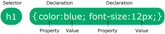
The selector points to the HTML element you want to style.
The declaration block contains one or more declarations separated by
semicolons.
Each declaration includes a CSS property name and a value, separated by a colon.
Multiple CSS declarations are separated with semicolons, and declaration
blocks are surrounded by curly braces.
In this example all <p> elements will be center-aligned, with a red
text color:
p
{
color: red;
text-align: center;
}
-
is a selector in CSS (it points to the HTML element you want to style:
<p>). - is a property, and is the property value
- is a property, and is the property value
You will learn much more about CSS selectors and CSS properties in the next chapters!
❮ Previous
Next ❯
CSS Border Shadow
You can combine the CSS box-shadow property with the border property when you need to create a shadow effect. Two values are necessary to set the box-shadow property that is the v-offset and the h-offset:
- h-offset: The value defines horizontal shadow offset. A negative value set applies the shadow on the left side while a positive value applies the shadow on the right side.
- v-offset: The value defines the vertical shadow offset. A negative value applies the shadow above while a positive value applies the shadow below the box.
H-offset and v-offset accept four values that translate into shadow. These values include:
- Blur: Add a third value to include a blur effect. The shadow blur increases the higher the number.
- Spread: Add a fourth value that defines the shadow spread. A negative value decreases the shadow size while a positive value increases it.
- Color: Add a color value to establish the shadow color. When you fail to define a shadow color, it will assume the color of the text.
- Inset: Add the inset keyword to define the shadow within the box.
What’s more, you can define various shadows. To do this, you just need to separate the values by commas. Ensure you increase the v- and h-offset values for the cascading shadows to make them visible.
CSS Properties
align-contentalign-itemsalign-selfallanimationanimation-delayanimation-directionanimation-durationanimation-fill-modeanimation-iteration-countanimation-nameanimation-play-stateanimation-timing-functionbackface-visibilitybackgroundbackground-attachmentbackground-blend-modebackground-clipbackground-colorbackground-imagebackground-originbackground-positionbackground-repeatbackground-sizeborderborder-bottomborder-bottom-colorborder-bottom-left-radiusborder-bottom-right-radiusborder-bottom-styleborder-bottom-widthborder-collapseborder-colorborder-imageborder-image-outsetborder-image-repeatborder-image-sliceborder-image-sourceborder-image-widthborder-leftborder-left-colorborder-left-styleborder-left-widthborder-radiusborder-rightborder-right-colorborder-right-styleborder-right-widthborder-spacingborder-styleborder-topborder-top-colorborder-top-left-radiusborder-top-right-radiusborder-top-styleborder-top-widthborder-widthbottombox-decoration-breakbox-shadowbox-sizingbreak-afterbreak-beforebreak-insidecaption-sidecaret-color@charsetclearclipclip-pathcolorcolumn-countcolumn-fillcolumn-gapcolumn-rulecolumn-rule-colorcolumn-rule-stylecolumn-rule-widthcolumn-spancolumn-widthcolumnscontentcounter-incrementcounter-resetcursordirectiondisplayempty-cellsfilterflexflex-basisflex-directionflex-flowflex-growflex-shrinkflex-wrapfloatfont@font-facefont-familyfont-feature-settingsfont-kerningfont-sizefont-size-adjustfont-stretchfont-stylefont-variantfont-variant-capsfont-weightgapgridgrid-areagrid-auto-columnsgrid-auto-flowgrid-auto-rowsgrid-columngrid-column-endgrid-column-gapgrid-column-startgrid-gapgrid-rowgrid-row-endgrid-row-gapgrid-row-startgrid-templategrid-template-areasgrid-template-columnsgrid-template-rowshanging-punctuationheighthyphensimage-rendering@importisolationjustify-content@keyframesleftletter-spacingline-heightlist-stylelist-style-imagelist-style-positionlist-style-typemarginmargin-bottommargin-leftmargin-rightmargin-topmask-imagemask-modemask-originmask-positionmask-repeatmask-sizemax-heightmax-width@mediamin-heightmin-widthmix-blend-modeobject-fitobject-positionopacityorderorphansoutlineoutline-coloroutline-offsetoutline-styleoutline-widthoverflowoverflow-wrapoverflow-xoverflow-ypaddingpadding-bottompadding-leftpadding-rightpadding-toppage-break-afterpage-break-beforepage-break-insideperspectiveperspective-originpointer-eventspositionquotesresizerightrow-gapscroll-behaviortab-sizetable-layouttext-aligntext-align-lasttext-decorationtext-decoration-colortext-decoration-linetext-decoration-styletext-indenttext-justifytext-overflowtext-shadowtext-transformtoptransformtransform-origintransform-styletransitiontransition-delaytransition-durationtransition-propertytransition-timing-functionunicode-bidiuser-selectvertical-alignvisibilitywhite-spacewidowswidthword-breakword-spacingword-wrapwriting-modez-index
